
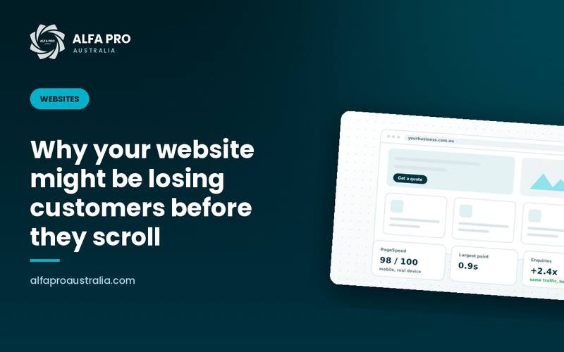
Most website conversations are about how a site looks. Most website problems are about how it behaves in the first few seconds on a phone, on mobile data, in a car park.
Four problems account for the majority of visitors an Australian business loses on its own website.
It takes too long to load on a phone
Bounce rate climbs sharply once a mobile page takes more than a few seconds to appear. Most visitors never get past that to see how good the rest of the site is.
The usual culprits are uncompressed hero images, a stack of third-party scripts, and fonts that block rendering. None of these are design decisions; they are build decisions, and they are fixable without redesigning anything.
The first screen does not say what you do
If the first screen does not make it obvious what you do and what to do next, visitors decide within seconds whether to stay. Most of that decision happens before any scrolling.
A clear statement of what you offer and who it is for beats a clever tagline. Then one obvious action. A page trying to sell a service, collect an email, promote a blog post and push a phone call all at once accomplishes less than a page with a single next step.
It was designed for a laptop
The majority of traffic for most Australian small businesses now arrives on a phone. A site that looks great on a 27-inch monitor and cramped on a phone is optimising for the wrong device.
Mobile-first is not a style; it is a sequence. Design the phone layout first, then let it expand. Doing it the other way around produces the squeezed, tap-target-too-small experience that most business sites still have.
Trust signals are missing
A visible phone number, real testimonials, actual photos of the premises or team, and clear proof of who is behind the business all reduce the hesitation a first-time visitor feels — often more than another round of visual polish would.
For local Australian businesses, an ABN, a service area and a real address do more for credibility than a stock photo of a handshake.
The form asks too much
Form friction quietly kills more conversions than bad design does. Every additional required field is another small reason to abandon.
Name, phone and what they need is usually enough to start a conversation. Asking for company size, budget band and three other details before any trust exists feels like an interrogation. Qualify on the call, not on the form — or offer WhatsApp, where people will happily tell you more in a conversation than they would type into a form.
Fast load, a clear first screen, mobile-first layout and a short form are not nice-to-haves. They are the difference between a visitor who explores and one who has already gone.
The short version
- Fix mobile load speed before you touch the design.
- Say what you do on the first screen, then give one clear action.
- Design for the phone first and let the layout expand.
- Show real proof: phone number, photos, address, reviews.
- Cut form fields to the minimum needed to start a conversation.